


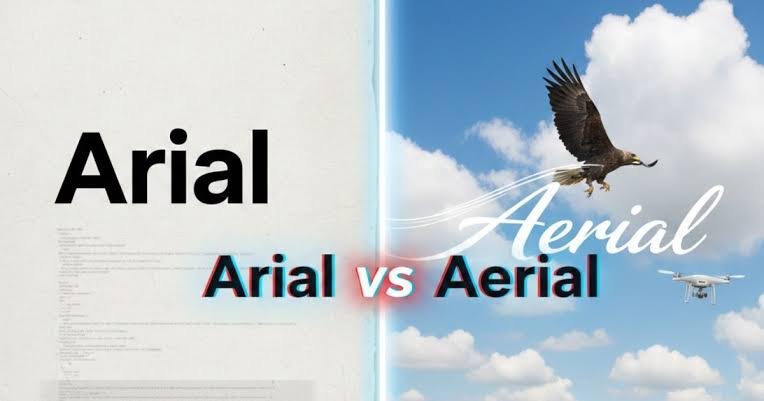
If you have ever opened Microsoft Word, searched for a font, and wondered whether it was spelled Arial or Ariel, you are far from alone. The Arial vs ariel confusion happens because the two terms look almost identical, sound similar in many accents, and are both legitimate spellings in the right context.
But they do not mean the same thing.
Arial is the familiar sans-serif typeface used in documents, presentations, websites, signs, reports, and countless other designs. Ariel, meanwhile, is primarily a proper name and is also famously associated with literature and popular culture.
That one-letter change matters.
If you are talking about typography, the correct word is Arial. If you are referring to a person or character named Ariel, then Ariel is correct.
This guide breaks down Arial vs ariel in practical terms, explains why the mix-up happens, and shows you how to choose the right spelling every time.
Arial vs Ariel: What Is the Main Difference?
The fastest way to understand the difference is this:
| Term | What It Usually Means | Correct Example |
|---|---|---|
| Arial | A sans-serif typeface/font | Change the document font to Arial. |
| Ariel | A proper name or character name | Ariel appears in Shakespeare’s The Tempest. |
| Aerial | Something related to the air or viewed from above | The drone captured an aerial photograph. |
For most people searching Arial vs ariel, the question is really:
“Is the font called Arial or Ariel?”
The answer is Arial.
Microsoft describes Arial as a contemporary sans-serif typeface originally designed in 1982 by Robin Nicholas and later developed with Patricia Saunders. Microsoft subsequently licensed Arial as part of the core fonts included with Windows 3.1.
Ariel, with an e, is not the spelling of that Microsoft font.
That distinction may seem small, but using the correct term matters in professional documents, graphic-design instructions, academic work, web-development discussions, and font searches.
What Is Arial?
Arial is one of the most recognizable sans-serif typefaces in modern computing.
A sans-serif typeface does not have the small decorative finishing strokes commonly found on traditional serif fonts such as Times New Roman. Arial therefore has a relatively clean, straightforward appearance.
You have probably seen it thousands of times without consciously noticing it.
Arial can appear in:
- Business reports
- Microsoft Word documents
- Presentations
- Advertisements
- Signs
- Worksheets
- Website layouts
- Forms
- Email graphics
- Spreadsheets
- Printed instructions
- Educational material
Microsoft’s typography documentation describes Arial as a versatile family suitable for text in reports, presentations, magazines, newspapers, advertising, and promotional material.
Why Is Arial So Familiar?
The history behind the Arial vs ariel question partly explains why people know the word Arial even when they are unsure how to spell it.
Arial became especially familiar to computer users after Microsoft licensed it for Windows. As Windows and Microsoft Office reached millions of homes, schools, and businesses, users repeatedly encountered Arial in font menus.
Its name became part of everyday digital vocabulary.
People who know almost nothing about professional typography may still recognize names such as:
- Arial
- Times New Roman
- Calibri
- Verdana
- Courier New
That widespread exposure is one reason a misspelling such as “Ariel font” can feel surprisingly natural.
What Does Ariel Mean?
Ariel is a legitimate word, but it serves a completely different purpose.
Rather than being the standard spelling of Microsoft’s Arial typeface, Ariel is commonly used as a proper name.
It also has an important literary association.
Merriam-Webster identifies Ariel as the name of the spirit in William Shakespeare’s The Tempest, with that usage dating back to around the early seventeenth century.
Modern readers may recognize Ariel through other fictional characters and personal names as well.
So if you write:
“Ariel is my favorite character.”
the spelling may be perfectly correct.
If you write:
“Please format the report in 12-point Ariel.”
you probably mean 12-point Arial.
Context solves the problem.
Arial vs Ariel in Typography: Which Is the Correct Font?
When discussing Microsoft’s familiar sans-serif typeface, Arial is the correct spelling.
This is arguably the most important answer in the entire Arial vs ariel debate.
Correct:
Arial font
Incorrect when referring to the Microsoft typeface:
Ariel font
Suppose your manager sends you this instruction:
Use Arial, 11 pt, for the body text.
That is a normal typography instruction.
Now imagine the instruction says:
Use Ariel, 11 pt.
You may understand what the person intended, but searching the standard font menu for “Ariel” may not lead you to Arial because the names are different.
An Easy Memory Trick
Remember this phrase:
Arial has an “a” before the final “l,” and Arial is the font.
You can also associate the beginning of Arial with the “A” in alphabet.
A = Arial = alphabet/font
For Ariel, think of a person’s name.
It is not a formal linguistic rule, but it is an easy memory device when you need the answer quickly.
Why Do People Confuse Arial and Ariel?
The Arial vs ariel spelling problem is surprisingly understandable.
There are several reasons.
1. The Spellings Are Almost Identical
Look at them side by side:
Arial
Ariel
Only one vowel changes.
When people type quickly, that tiny difference is easy to overlook.
2. Pronunciation Can Sound Similar
Depending on a speaker’s accent, pronunciation, and speed, Arial and Ariel may sound close enough that a listener cannot confidently determine the intended spelling.
Someone might hear:
“Use Arial.”
and mentally interpret it as:
“Use Ariel.”
Written context becomes important.
3. Ariel Is Already a Familiar Name
People frequently encounter Ariel as a personal or fictional name.
Because the spelling Ariel already looks familiar, the brain may automatically choose it when someone mentions the font.
This is a classic example of familiarity influencing spelling.
4. Spellcheck May Not Save You
A particularly interesting issue with Arial vs ariel is that both forms can be legitimate terms.
If you type “Ariel,” software cannot always assume that you intended “Arial.”
You may genuinely be discussing someone named Ariel.
That means ordinary spellcheck is less useful than it would be for a completely invented spelling.
The writer must understand the context.
Arial vs Ariel vs Aerial: Do Not Confuse These Three
There is another word worth adding to the discussion: aerial.
People sometimes confuse all three:
Arial, Ariel, and aerial.
They may sound similar, but their meanings are dramatically different.
Arial
Use Arial when talking about the typeface.
Example:
“The resume is formatted in Arial.”
Ariel
Use Ariel for the proper name or relevant literary character.
Example:
“Ariel is an important character in The Tempest.”
Aerial
Use aerial when describing something related to the air, flying, or a view from above.
Example:
“The photographer captured an aerial view of the coastline.”
Therefore:
Arial view = usually wrong
Ariel view = usually wrong
Aerial view = correct
This additional distinction is valuable because someone searching Arial vs ariel may actually be trying to spell “aerial.”
When Should You Use Arial?
Use Arial whenever you specifically mean the typeface.
Typical situations include font instructions, design briefs, school formatting requirements, website discussions, printing specifications, or office documents.
For example:
- “Set the paragraph text in Arial.”
- “Arial Bold works better for this heading.”
- “The client requested Arial for the presentation.”
- “Change the font from Times New Roman to Arial.”
- “The form uses Arial throughout the document.”
Notice something important: Arial is normally capitalized because it is the name of a specific typeface.
Writing “arial” in casual search queries is common, but Arial is the professional spelling.
When Should You Use Ariel?
Use Ariel when that is genuinely the person’s, character’s, place’s, or other proper name.
For example:
- “Ariel submitted the report yesterday.”
- “The character Ariel appears in The Tempest.”
- “I spoke with Ariel about the project.”
- “Her name is spelled Ariel.”
This gives us another simple rule for the Arial vs ariel problem:
Typography = Arial
Proper name = Ariel
That will solve the majority of real-world cases.
Is Ariel a Font?
This question requires slightly more precision than many quick online explanations provide.
If someone asks whether the familiar Windows font is called Ariel, the answer is no: the font they almost certainly mean is Arial.
However, it would be too broad to claim that no designer anywhere has ever created a font containing “Ariel” in its name. Thousands of commercial and independent typefaces exist.
The important distinction is this:
Ariel is not an alternative spelling of Microsoft’s Arial typeface.
If instructions specify Arial, spelling it Ariel changes the typeface name.
That level of precision matters because search engines, software menus, design platforms, and font libraries work with specific names.
Is Arial Still Used Today?
Yes.
Despite newer typefaces becoming popular in operating systems, apps, websites, and corporate branding, Arial remains a widely recognized and practical font.
Its strengths are straightforward:
- Familiar appearance
- Broad availability
- Clear letterforms
- Multiple weights and styles
- Long history in office documents
- Suitability for many everyday layouts
Microsoft continues to maintain documentation for the Arial font family, including its styles, history, files, and availability.
That continued presence explains why Arial vs ariel remains a relevant spelling question rather than merely a historical curiosity.
Is Arial the Same as Helvetica?
No.
This is another typography question frequently connected to Arial.
Arial and Helvetica share a broadly similar neo-grotesque/sans-serif visual category, which is why casual users sometimes struggle to distinguish them at a glance. They are nevertheless separate typefaces.
If a document asks specifically for Arial, you should not silently substitute another font merely because it looks similar.
Typeface choice can affect:
- Character widths
- Line breaks
- Page length
- Visual hierarchy
- Brand consistency
- Document appearance
In ordinary writing, the differences may seem subtle. In professional typography, publishing, design systems, or tightly formatted documents, those differences can matter considerably.
Common Arial vs Ariel Mistakes to Avoid
Understanding the definitions is easy. Remembering them while typing is where errors happen.
Here are the most common mistakes.
Mistake 1: Writing “Ariel Font”
If you mean the familiar typeface, write Arial font.
Mistake 2: Changing Someone’s Name to Arial
If a person’s name is Ariel, do not “correct” it simply because you recognize Arial from Microsoft Word.
Names have their own spellings.
Mistake 3: Writing “Arial View”
If you mean a photograph taken from above, the word you need is aerial.
Correct:
aerial view
Mistake 4: Assuming Similar Pronunciation Means Similar Meaning
English contains many words that sound alike or nearly alike but carry different meanings.
Always check context.
Mistake 5: Trusting Autocorrect Completely
Autocorrect can help with obvious spelling mistakes. It cannot reliably determine whether you intended the typeface Arial or the proper name Ariel.
Proofread the sentence yourself.
How to Remember Arial vs Ariel Permanently
If you keep forgetting the difference, use this three-step test.
Step 1: Ask Whether You Mean a Font
If yes, choose:
Arial
Step 2: Ask Whether You Mean a Person or Character
If yes, the spelling may be:
Ariel
Of course, verify the actual person’s name when writing about a real individual.
Step 3: Ask Whether You Mean Something in the Air
If yes, choose:
Aerial
The pattern is easy to memorize:
Font → Arial
Name → Ariel
Air/above → Aerial
Once you recognize those three categories, the spelling problem largely disappears.
Arial vs Ariel Examples in Real Sentences
Examples often make the distinction clearer than definitions alone.
Correct Arial examples:
- The teacher requested Arial for the assignment.
- I changed the presentation headings to Arial Bold.
- Please use 12-point Arial in the final document.
- Arial gives the form a simple, familiar appearance.
Correct Ariel examples:
- Ariel joined the meeting this morning.
- Shakespeare’s Ariel is a spirit in The Tempest.
- I need to confirm how Ariel spells her surname.
- The invitation was addressed to Ariel.
Correct aerial examples:
- The drone recorded aerial footage.
- We examined an aerial map of the property.
- The documentary included impressive aerial photography.
- An aerial inspection revealed damage to the roof.
Seeing the terms in context makes the Arial vs ariel distinction considerably easier to remember.
Why Correct Spelling Matters in Professional Work
Someone could reasonably ask: does one vowel really matter?
Yes, especially when accuracy is part of your job.
Consider a graphic designer receiving the instruction:
“Use Ariel throughout the brochure.”
If “Arial” was actually intended, that spelling mistake introduces unnecessary uncertainty.
The same problem can appear in:
- Brand guidelines
- Academic formatting rules
- Print specifications
- Web-development tickets
- Client feedback
- Editing instructions
- Presentation templates
Correct terminology makes communication faster.
It also reduces the possibility of someone selecting or searching for the wrong resource.
This is where understanding Arial vs ariel becomes more than a spelling exercise. It becomes a small piece of professional communication.
Quick Answer: Arial or Ariel?
If you arrived here because you simply wanted the correct font spelling:
The font is Arial.
Not Ariel.
Use Ariel when referring to the proper name, and use aerial when referring to something associated with the air or viewed from above.
A quick cheat sheet:
- Arial = font
- Ariel = name
- Aerial = air/from above
Save those three lines and you are unlikely to confuse them again.
Conclusion: Getting Arial vs Ariel Right Is Easy Once You Know the Context
The Arial vs ariel difference comes down to one simple question: what are you talking about?
If you mean the well-known sans-serif typeface found across computer documents and design applications, the correct spelling is Arial.
If you mean a person or character with that name, use Ariel.
And if you are talking about something viewed from the sky, flying, or related to the air, you probably need aerial instead.
The easiest rule to remember is:
Arial is the font. Ariel is the name. Aerial relates to the air.
Before submitting your next document, design brief, article, or email, take two seconds to check the context. That tiny spelling check can make your writing clearer, your instructions more precise, and your work look noticeably more professional.
Frequently Asked Questions
1. Is the font spelled Arial or Ariel?
The correct spelling of the familiar Microsoft typeface is Arial. Microsoft documents Arial as a sans-serif typeface originally designed in 1982. “Ariel” is not an alternative spelling of Arial. If a teacher, employer, or client asks you to use the standard font, write Arial font.
2. What is the difference between Arial vs Ariel?
In the Arial vs ariel comparison, Arial usually refers to a typeface, while Ariel is primarily a proper name. The terms may look and sometimes sound similar, but they belong to different contexts. Arial belongs to typography; Ariel commonly belongs to names and literature.
3. Is Ariel another version of Arial?
No. Ariel is not another style or weight of Arial. Arial itself comes in multiple styles and weights, such as regular, bold, italic, and bold italic. If you see “Ariel” where the familiar computer font is intended, it is most likely a spelling error rather than another version of Arial.
4. Which is correct: Arial view, Ariel view, or aerial view?
Aerial view is correct when describing a view from above, such as an image captured by an aircraft, drone, or elevated camera. Arial is a typeface, while Ariel is a proper name. Therefore, neither “Arial view” nor “Ariel view” normally expresses the intended meaning.
5. Why is Arial often misspelled as Ariel?
The spellings differ by only one vowel, and their pronunciations can sound similar depending on the speaker’s accent. Ariel is also already familiar as a personal and fictional name, making it an easy spelling for the brain to substitute automatically. The simplest memory rule is Arial = font, Ariel = name, aerial = air.
